
Case study
Petco
Concept project
The Pet industry has been one of the fastest-growing industries since the beginning of the pandemic. Our directive was to find ways to improve the user experience on the Petco app.
Role: UX Designer/Researcher
Responsibilities included leading on UI design, user interviews, usability tests, user flows, service blueprint, competitive & comparative analysis, journey map, storyboard, product and team management
Deliverables: Petco hi-fi mobile app prototype
Timeline: 3 weeks
UX Tools: Figma, FigJam, Trello
Background
According to American Veterinary Medical Association, people have started adopting more pets since the pandemic started in 2020 because they have more time at home and feel a need for companionship. About 42% of new pets are cats and dogs from local shelters, many of which work directly with stores like Petco to help arrange the adoptions.

Project brief / Petco's Concerns
Petco , one of the largest pet retailers and care providers in the U.S. launched the app during the height of the pandemic and had the following goals:
Focus on improving services
Evaluating social distancing and Covid guidelines
Appointment management
Introduce telehealth
To begin our research, we conducted a competitive and comparative analysis to discover industry trends, common design patterns, and best practices. We found many competitors had similar shopping cart icon designs, in-app contact features, and the option to create a personal account.
We next conducted 5 user interviews and usability tests. In addition, we wrote a questionnaire and received 99 responses. Based on pre-existing market research, all of the users we targeted were dog owners aged 18-45.
We asked participants to complete 4 tasks:
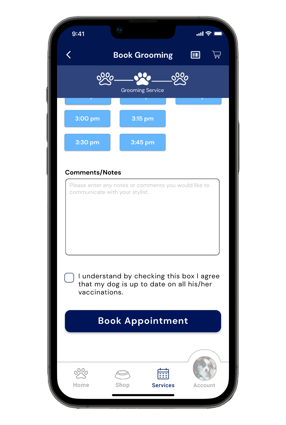
Book a grooming appointment
Book a vet appointment
Find an upcoming appointment and reschedule a grooming appointment
Cancel a vet visit
Research Findings
4 out of 5 participants completed the tasks on average of 4 minutes and 50 seconds.
Using affinity mapping, our team synthesized our findings to the following major points.
Telehealth was found not to be a priority by users
Users expressed a desire to enhance user experience through personalization and familiarity
The usability test revealed the following pain points.
Users couldn’t cancel the vet appointment in the app.
It was not easy to manage appointments.
Lack of visual signifiers to show login status.
Personas and user flow
Based on our research we created two personas in order to feel more connected with our users.

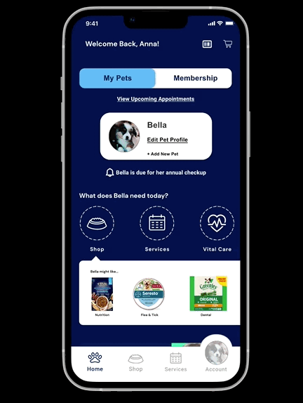
Anna and Bella, 24
“I didn’t buy a coat I saw online last night because I have to save money for Bella.”
Story: Anna drives by Petco every day on the way to her coffee shop. One day, she saw a dog adoption event in front of Petco and decided to adopt her first-ever dog, Bella. She immediately fell in love with Bella and her pretty round eyes. However, she is realizing how hard it is to take care of a puppy, in terms of both time and money. Since she adopted Bella at Petco and the store is located on her daily commute, she decided to set up her first veterinary appointment to get Bella all her shots at Petco’s hospital.
Needs and Goals: she needs advice for first time pet ownership (supplies, habits, etc.) her goal is to give her dog a great life and be a responsible dog owner. She wants reliable guidance from professionals when she has questions.
Pain Points: She doesn’t know which providers or stores best suit her dog’s needs. She has limited time for research and appointment management.
As we got to understand Anna we realized she needs to be able to easily manage her appointments and services so she can save time and avoid confusion while increasing app traffic for Petco.
This led to us to pose the question:
How might we create an intuitive appointment management system that allows Anna to cancel and reschedule appointments on the app?
After using affinity mapping to brainstorm a range of solutions our team settled on this approach:
We will add a “cancel vet appointment” feature in the user flow.
This way busy users like Anna can save time without frustration.
Devon and 3 poodles, 40
Story: Devon has 3 poodles that he loves dearly. He works 9-5 at an urgent care clinic, and loves going to the dog park on the weekends. Sometimes his dogs have a little too much fun in the mud, which is why he is a Petco rewards member. He uses Petco for all of his dogs’ needs, but wishes he didn’t have to call every time to make appointments. He loves a good sale, especially when curbside pickup or delivery are offered.
Behaviors: He is a loyal Petco customer and likes when the staff remembers his dogs. He appreciates grooming rewards.
Pain Points: He has to call during operating hours to make an appointment and doesn’t like a confusing scheduling system. He was not happy once he was treated like a new customer by businesses that he uses frequently.
Devon wants to receive personalized services to make him feel supported as a pet owner and, in turn, increase engagement with the rewards program.
How might we reimagine the way returning users as Devon engage with the app to create a sense of community that would mimic the environment of in-person services?
During our usability testing we found pain points in our second user goal, which was to make a grooming appointment and reschedule the appointment.
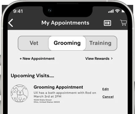
To make the process clearer for users like Devon, our team decided to change the appointment page to include a toggle to easily switch between three options: “Vet,” “Grooming,” and “Training.”
We also need to solve other users’ problems. We need to improve following
universalize the login page
include a “book again” feature for repeat grooming services
add a reminders feature for vaccines and annual visits
Now that we had a good sense of who our users were and what their goals were, I created this storyboard to imagine what an ideal customer journey would look like.

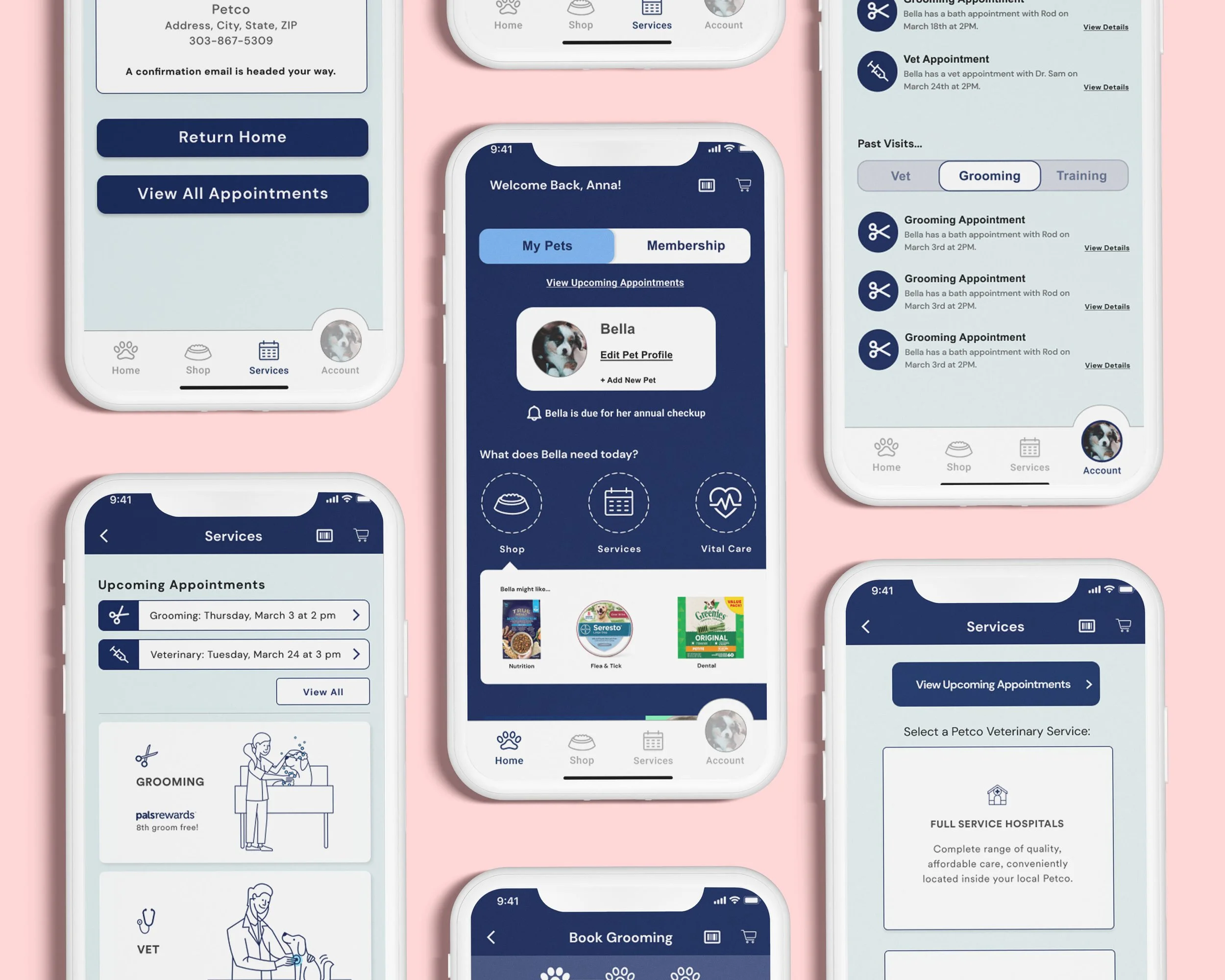
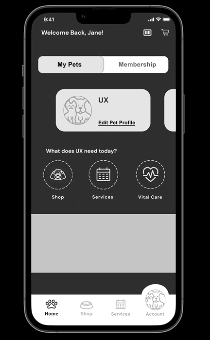
Prototype 1
To begin our sketches, we used an approach called design studio, where each team member provides 6 design ideas and we vote together to choose the best design solutions. We also came up with an idea of Pawgress bar instead of the current grooming reward program punchcard. Based on our research, we developed our prototype 1.

Prototype 1 usability test
Our usability tests for our first and second prototypes followed the same script as our initial test on the current Petco app.
We found that 4 out of 5 participants completed the tasks on average 3 minutes and 30 seconds. On average, the task completion was shortened by 1 minute and 20 sec compared to the current Petco app
From our usability test we also learned:
Navigation: Users generally found the app easy to navigate
Pawgress bar: Users were confused about the grooming rewards
Grooming flow: Users had trouble navigating the grooming dropdowns
Upcoming appointments: Users had trouble accessing appointments from the homepage
Calendar: Users wanted the "add to calendar" feature and confirmation email
Hi-fi prototype 2
After our first prototype test, we decided to return to an idea from our design studio as a solution to the rewards program and incorporated a punchcard inspired design.
We also added calendar and email confirmation windows to give better feedback to users. In order to develop a hi-fi prototype, we used Petco’s original color palette and fonts to create a familiar feel for the customers.


Hi-fi prototype 2 usability test
4 out of 4 participants completed the task on average 3 minutes. This means overall this app saved 1 minute and 50 seconds from the original Petco app and was 30 seconds shorter than prototype 1.
Here were our findings:
Navigation: Users generally found the app easy to navigate
Pawgress bar: Users understood the new iteration of the punchcard
Grooming flow: Users were able to navigate through the grooming process
Upcoming appointments: Users succeeded in accessing appointments from home & navigation bar
Next Steps
To keep improving the user experience our team had several ideas.
Consider adding a “Comment/Note” section for sensitive or anxious dogs so the groomers and vets can prepare beforehand
Add feedback to the punchcard as illustrated below.
We would also evaluate the content and consider resizing the text and reducing text when icons could be used instead.

Katie, Kir, Kip, and Tallulah, thank you very much for the great teamwork!!
Arigato. ありがとう。